User Tools
Sidebar
Table of Contents
<!– uid=38ef530386634042d8f838271aa1371e347f0571 –> <!– name=An Keqiang –> <!– email=campumoru@gmail.com –> <!– time=1327597593 –> <!– ip=86.67.96.72 –> <!– content-type=text/html –> Sometime it can be useful to share a map with all the different layers in a Photoshop version instead of an ArcView file. A lot more people know how to use Photoshop, and you also donât have to send all the GIS data along with your file.
Here is a brief guide for creating such a map.
The basic idea is, in ArcView, to export each layer separately with a transparent background. The second idea is to group some layers together in this process to avoid to have too many messy layers in the Photoshop file that would be hard to understand and manage for a non-specialist user. In the following guidelines weâre going to follow an easy example. This example is a map of the Tibetan counties of TAR, Sichuan, Qinghai, Gansu and Yunnan, along with the surrounding countries:
1) In ArcView:
For such a map the layering in ArcView is as follow:
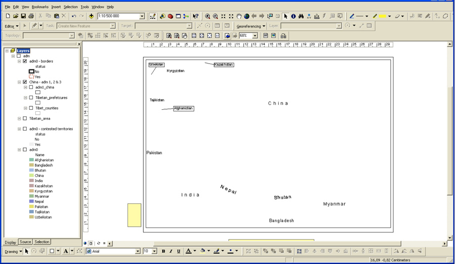
As you can see, there are 7 layers. In order to handle the labels more easily, they have been transformed as annotations. There are here two groups of annotations: the names of the countries, and the numbering of the counties. Finally, there is also the legend (including the north arrow and the scale), which is also going to be handled separately. Before to begin the export of the layers, double-click on âLayersâ on the left at the top of the different layers in order to bring the settings of the dataframe. There, on the tab âFrameâ set the background color as transparent (ânoneâ in other words in ArcView language).
To export the first layer, you have to turn all the annotation groups off, and move the legend + north arrow + scale out of the frame. In our example, the base layer is going to be the colors of the countries. Turn all the layers off, except the base layer which is âadm0â. Here is a good example as for when one can group sveral layers in a single one. Depending on how your data is structured, sometime you need two layers where you could have only one. Here, in order to depict the contested areas with a neutral greyish color, we had to add a layer on top of âadm0â which is called âadm0 â contested territoriesâ. The lambda user doesnât need to have these two layers, as they both participate for the same basic layer. So in this first export we are going to leave these two layers turned on, as in the picture below:
In the âExport Mapâ dialog box (to be found in âFileâ menu), set the image as a png, and in the second tab set the background color as ânoneâ.
Proceed like that for all the different layers, without forgetting to group those that can be grouped together. Each export will be a different layer in Photoshop. In our example I could have added the white Tibetan areas with the base layer, but for a particular reason I wanted to let the option to the person to who this map was intended to be able to turn on and off this layer â so I made it a separate layer.
When you export only lines, you have something like that:
Setting the background as ânoneâ both in the dataframe properties and in the âExport Mapâ dialogue box is very important, otherwise it will screw all the white areas and lines of your map. One example is the white polygon for the Tibetan areas. Although it looks dumb like that when youâre going to export it:
If you set the transparencies right you will have this resulting image:
For the labels, you have to turn all the layers off. You can, if itâs adapted for the needs of the person for who the map is intended, group all the annotation groups together. In this example the person needed to be able to turn the numbering of the counties off. So we created two layers: one for the labels of the countries, another one for the labels of the counties.
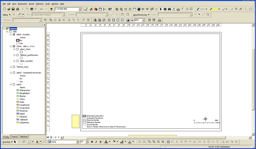
Finally, you have to export the legend + North arrow + scale:
As a result, we have for this map 9 layers: 6 for the shapefiles, 2 for the labels, and one for the legend.
2) In Photoshop:
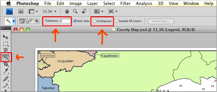
- Open the first image, copy it, and create a new document adding 0.5 cm to the height (This is in order to insert [VCP] logo and copyright information later on bellow the map) * Paste the image in the new document. Leave it centred, donât move the image from where it is pasted by default. * With the Magic Wand Tool (make sure to uncheck the âcontiguousâ option, and to set the âtoleranceâ to 0px) select the greyish color that is instead of the transparent areas, and delete it:
- Uncheck the default white layer named âBackgroundâ in order to see the white and grey squares of the background of the window. That way itâs easier to see if you successfully made your layer transparent:
- Open the next image, copy it, paste it in the document. Uncheck all layers except the one you just pasted in order to better appreciate the work youâre doing in the current layer. Select with the Magic Wand Tool the color you want to make transparent, and delete it. Repeat this action for all the images.
- You should now have something like that, with the layers in the order you pasted them:
- Sort the layers according to their priority of visibility, and rename them with simple names easy to understand. * If possible group the layers by theme (like all the labels in one group called âlayerâ, all the administrative borders in one group called âadministrative divisionsâ). Try to make straightforward names and grouping.
You should now have something like in the image a little further down.
- Select all the layers, and move them up in order to leave space at the bottom for [VCP]âs logo and copyrights information. * Insert [VCP]âs logo and copyright information. To see what is the format for them just look at the final map of this example. The font used is Skia. Youâre going to have two layers: one for the logo and one for the text.
At the end, merge them with the âBackgroundâ layer.
- Donât forget to save your work. Congratulations, youâre done!


